The Problem
BeneFIT, a new wellness startup, was struggling with low differentiation in a crowded fitness market (logos and visuals looked generic and outdated).Inconsistent branding across touchpoints (social media, merch, and digital ads had no cohesion).They had unclear positioning in the market; their mission to blend fitness with workplace wellness wasn’t translating visually.
The Solution
I created a bold, flexible identity system anchored by the core mark [b+] shorthand for benefit and positivity.
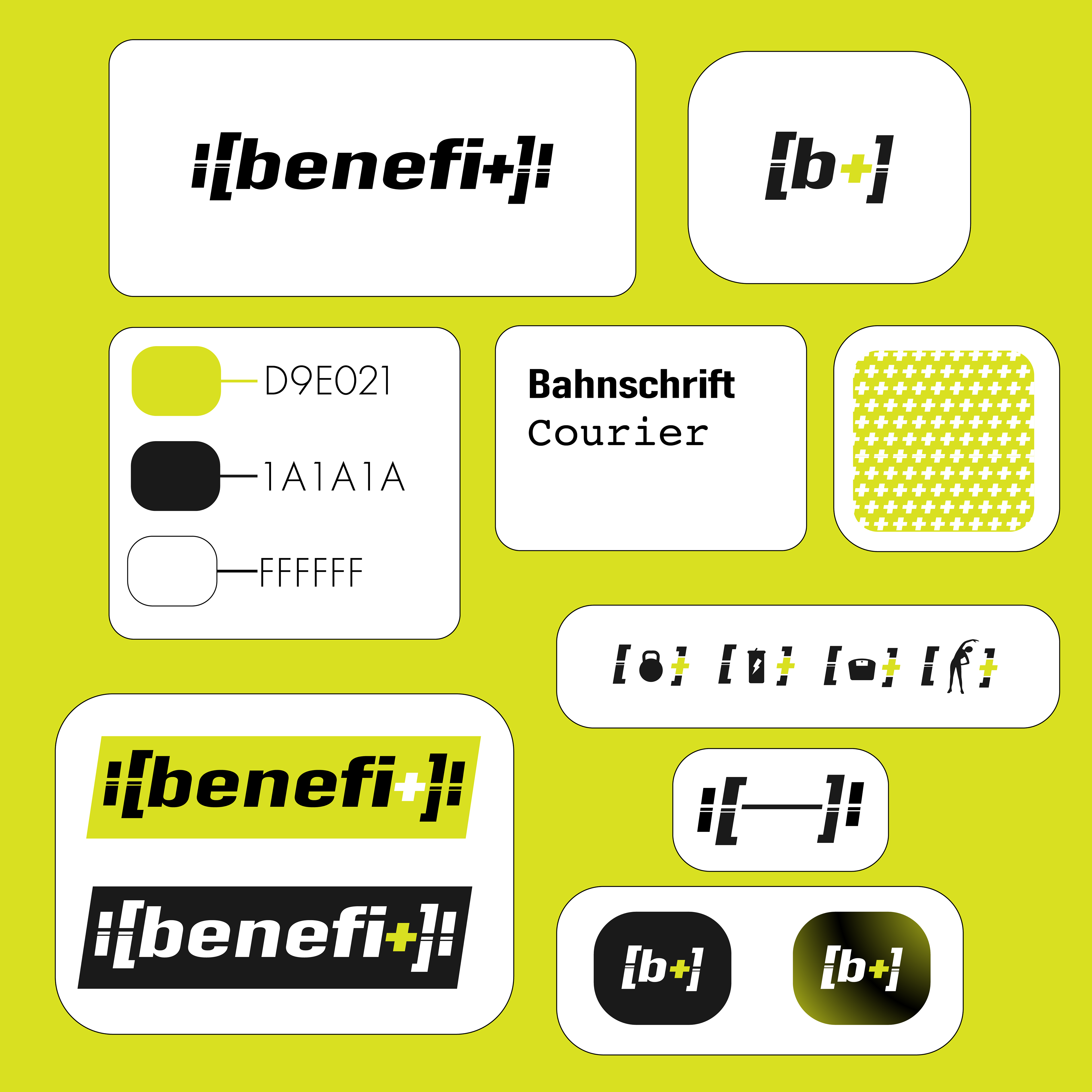
Typography & Colors: A clean, tech-inspired palette (lime green, black, white) communicates energy + modernity.
Logo Variations: Full [benefi+] logotype and shorthand [b+] allow for adaptability across large-scale and micro applications.
Patterns & Icons: Dynamic plus-sign patterns reinforce brand consistency across environments.
Collateral Mockups: Apparel, bottles, and digital screens to show how the brand lives in everyday fitness culture.
Impact
Brand Recognition: Consistent logo system + bold colors ensures instant recognition in gyms, online ads, and corporate wellness spaces.
Market Differentiation: Energetic visuals and shorthand [b+] identity distinguish BeneFIT from traditional gyms.
Projected Outcome: Clearer positioning → 20% increase in member inquiries within the first 3 months.
Projected Outcome: Estimated +15% new revenue stream from branded merch sales.
Consistency Across Channels: Unified fonts, colors, and design system ensure all touchpoints align.
Projected Outcome: Higher engagement (+25%) on social posts due to more professional look.
Takeaway
The BeneFIT identity system demonstrates how thoughtful design not only improves how a brand looks but also how it performs. By going back to the drawing board and engineering a flexible identity, BeneFIT is positioned to:
Attract new members, build loyalty through consistency, and expand revenue through branded lifestyle products.
