A Brand Update as fresh as the Cinnamon Rolls
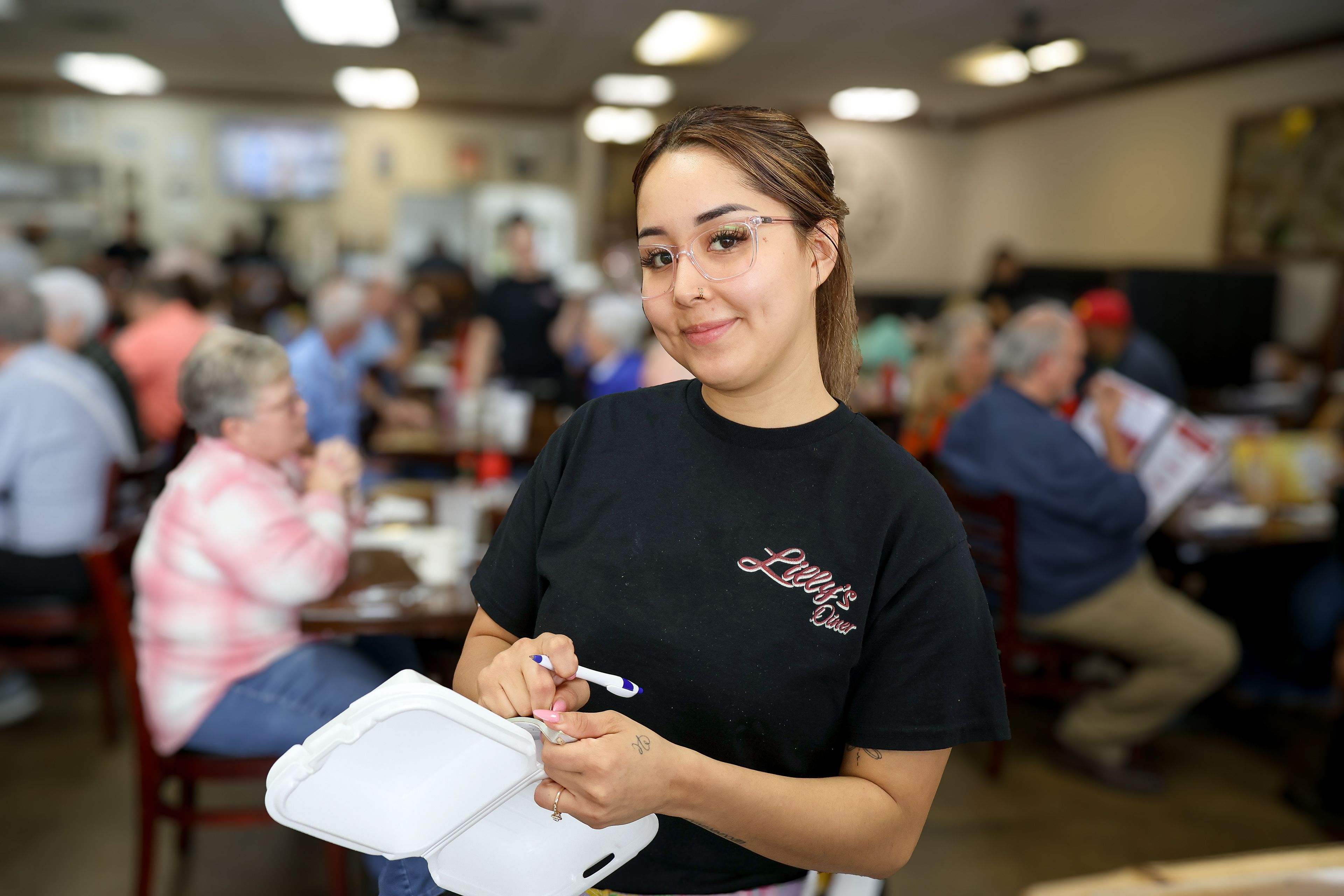
Lilly's Diner is a place that feels like a second home to most of it's reoccurring visitors. In a world where customers become just a face and a number, it's refreshing to be welcomed by a staple in the community that knows it occupants by name. This welcoming atmosphere has caused the owners to grow to the point where they're almost ready to open another location. With that, they wanted to tighten up and make sure the messaging is clear as they look to scale. This initiated the family-owned business to reach to me with a project about more than food, but legacy.
Change, without becoming unrecognizable.
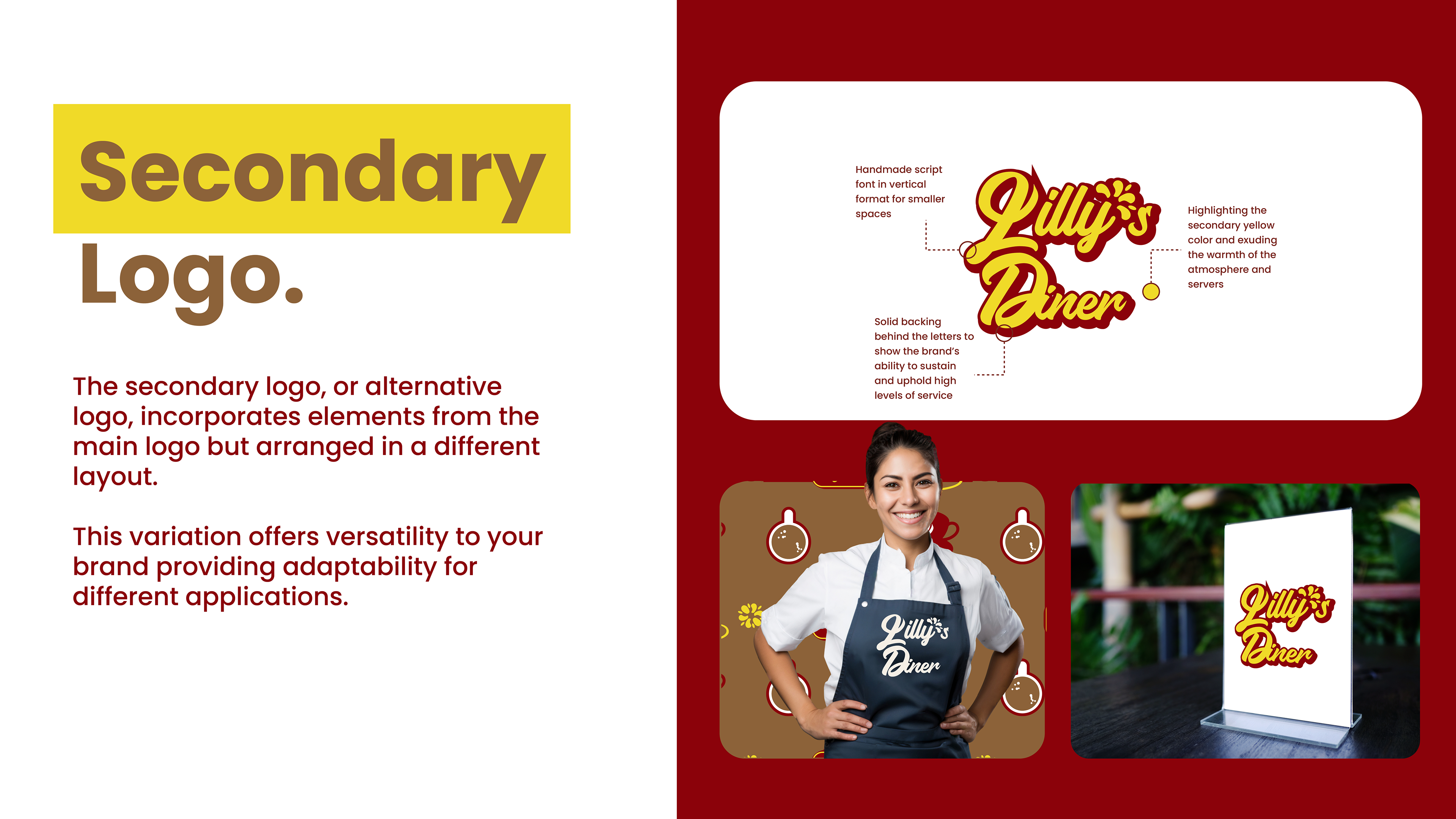
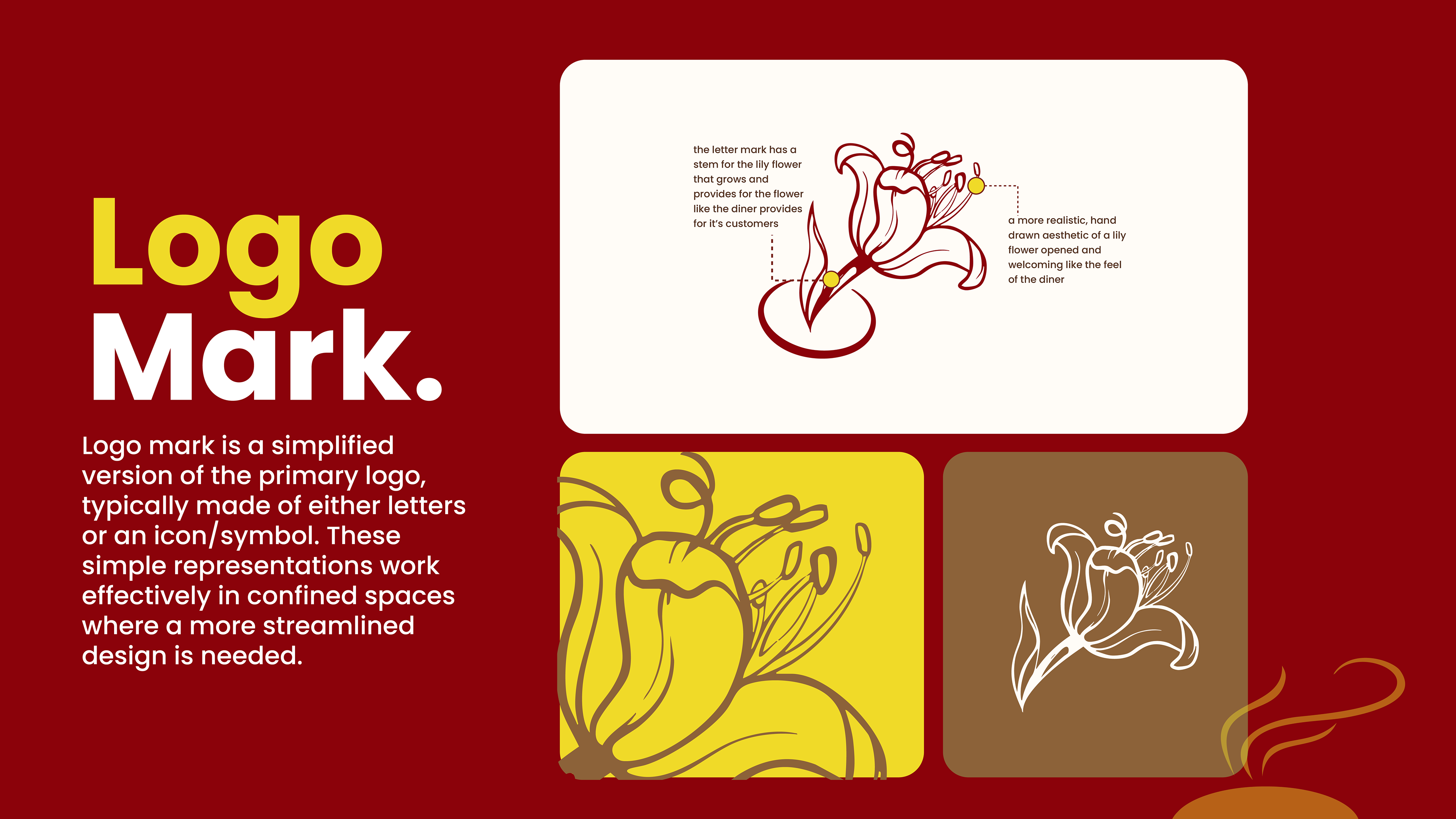
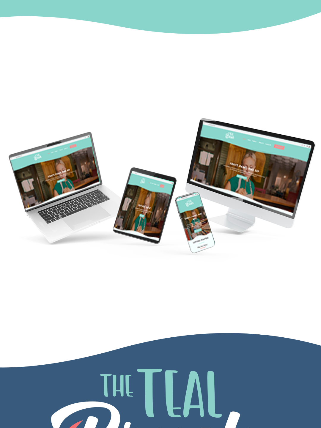
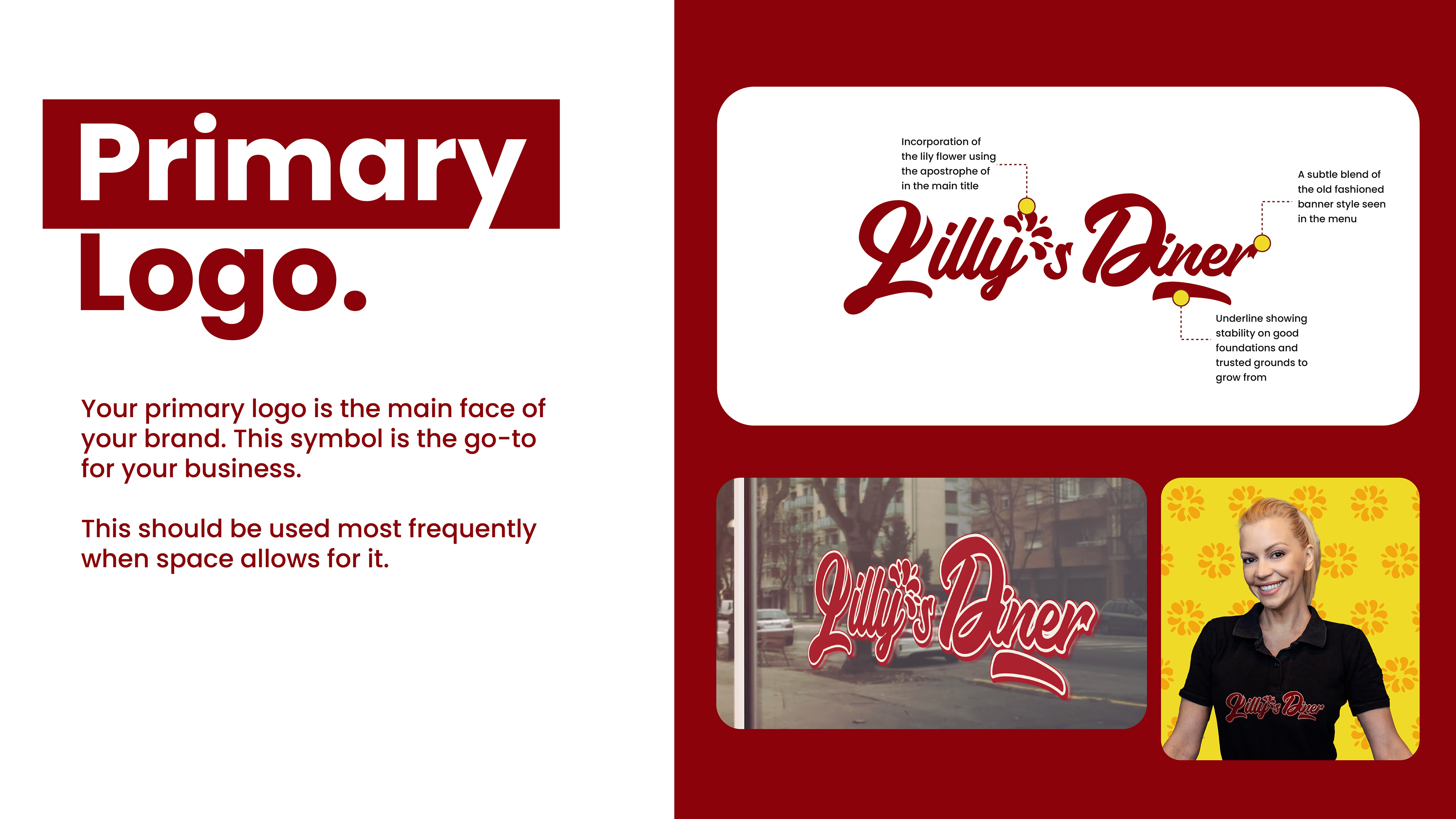
The goal here was to build and iterate from the previous visuals to clarify the messaging without disrupting the current loyal customer base built. I accentuated on the owner's name Lilly, turning the apostrophe into a flower to highlight the beginnings where the company started and it's growth like a flower, along with openness that the lily possesses just as the restaurant is welcoming and warm when guests come with their families to enjoy a meal. The script font is a nod to the old but modernized for smooth transition into it's implementation across various platforms such as the new website I also built out for them using Squarespace.